


THE DOODLE GUIDE TO WEBSITE DESIGN

A beautiful website.
A clearer next step.

You need a website people can actually use—not an attractive template with meaningless filler. A Webskout specialist works on your pages, navigation, messaging and mobile experience using the information you provide. We review the finished work ourselves and explain how customers can contact you or place an order.

This work is included in the $299/month all-in-one plan: see what the plan covers or request a free review.

✳ Designed for real people✳ Mobile-friendly✳ Built to explain and convert
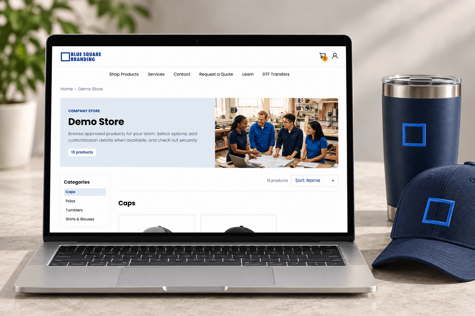
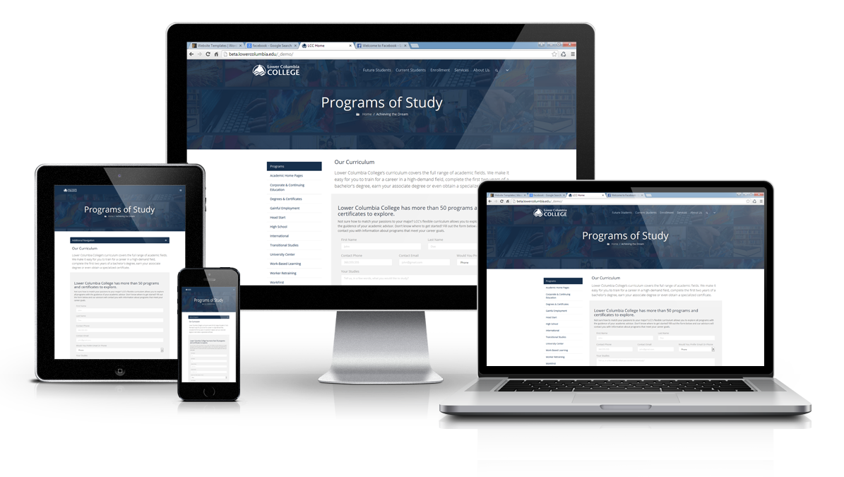
Designed website presented on laptop and mobile
good design makes the next step easy ✳
THE BIG IDEA

From first glance to real enquiry.

Think about the last time you needed to hire a service or buy something unfamiliar. You looked around, compared your options, asked whether you could trust the business, and searched for a simple next step. Your visitors do the same.

Customer journey from discovery to contact on a website
Being found when customers search online
01

Be discovered

A customer arrives from Google, an advertisement, social media, or a recommendation.

A welcoming website homepage makes visitors feel at home
02

Feel welcomed

The page loads cleanly and immediately makes it clear what your business offers.

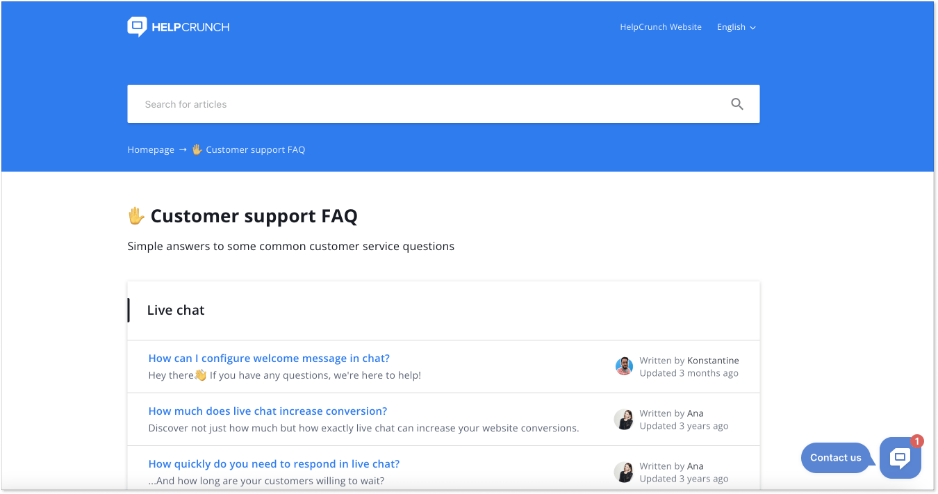
Website that answers customer questions quickly
03

Get an answer

Useful service information, prices where relevant, and FAQs remove confusion.

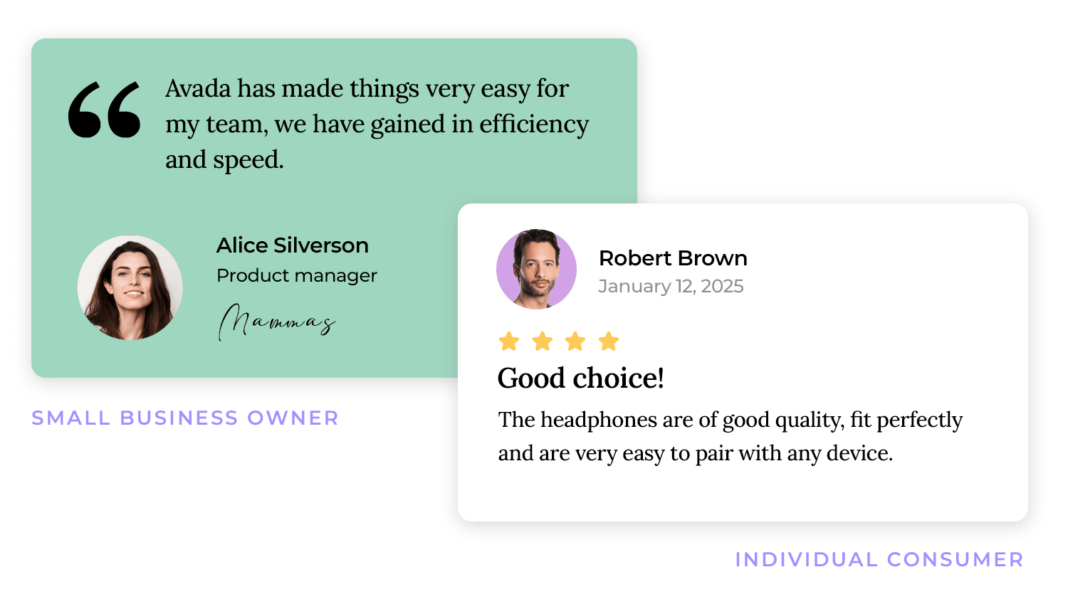
Customer reviews that build confidence
04

Gain confidence

Images, transparent explanations, real proof and contact details build trust.

Clear call to action that visitors click
05

Take action

A clear form, booking link, telephone number or email makes getting in touch easy.

This is an illustrative customer journey, not a promise of a particular conversion rate. The best route depends on your audience, product, and business goals.

THE WEBSKOUT APPROACH

Good-looking is good.
Useful is better.

Webskout combines visual design, helpful writing, clear navigation, and practical technical foundations. Rather than building a website that only looks impressive in a screenshot, we think through how someone will actually use it.

A welcoming website homepage makes visitors feel at home

Make a strong first impression

A distinctive, professional visual identity that fits the business.

Website that answers customer questions quickly

Explain your offer simply

Logical pages, useful headings, readable content, and obvious next steps.

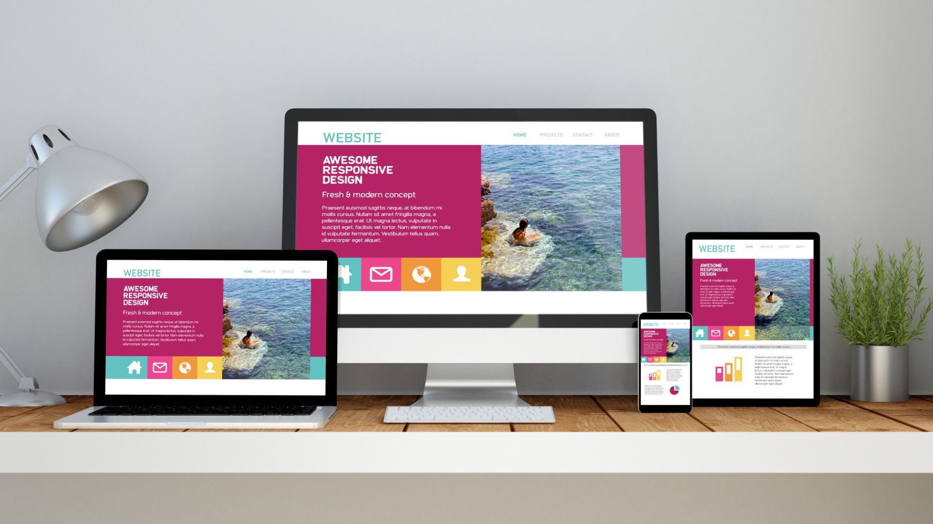
Website working beautifully on every device

Work on every device

Responsive layouts designed for mobile, tablet, and desktop visitors.

Clear call to action that visitors click

Make contacting you easy

Calls to action, contact forms, and enquiry paths that are clear and tested.

A WEBSITE FOR YOUR GOALS

Different businesses.
Different website needs.

The right website depends on what you offer and how your customers decide to buy. Choose an example below to see how the site structure and most important next step can change.

WHAT WE DO

From first sketch to working website.

Website design involves more than picking a theme and adding a logo. The sections below show the types of work Webskout can plan into a project. The final inclusions depend on the agreed brief, platform, integrations and content availability.

01
Discovery and direction workshop for a new website

Discovery & direction

We begin with your goals, audience, offers, competitors, existing website, and what you want visitors to do. This helps prioritize the pages and information worth building.

02
Website that answers customer questions quickly

Sitemap & page structure

We organize navigation and page relationships so people can find services, trust information, and contact details quickly. A sitemap helps prevent messy or duplicated pages.

03
A welcoming website homepage makes visitors feel at home

Visual UI design

We create page layouts, color balance, type hierarchy, buttons, illustration placement, and reusable sections. The design should feel like your business rather than an off-the-shelf demo.

04
Website working beautifully on every device

Responsive development

Pages are built to adapt across screen sizes, with readable text, sensible spacing, usable menus, and appropriately sized buttons and forms. Mobile experience is part of the build, not an afterthought.

05
Clear call to action that visitors click

Conversion pathways

We consider forms, calls, enquiries, bookings, product actions, and the journey between related pages. The visitor should know what to do without being pressured or confused.

06
Being found when customers search online

SEO-ready foundations

Descriptive page titles, logical headings, clean internal links, image descriptions, sensible URLs, and indexability settings provide a sound base for ongoing search work. Rankings cannot be guaranteed.

07
Website speed and usability test results

Speed & usability

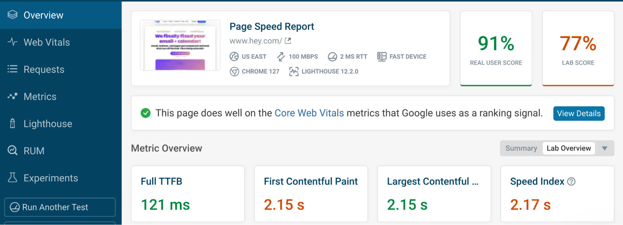
We review images, unnecessary scripts, responsive images, layout stability, readable contrast, and keyboard usability. Real performance depends on hosting, assets, and installed services.

08
Simple online forms and essential integrations

Forms & essential integrations

Depending on the project, we can connect working enquiry forms, analytics events, CRM routing, booking tools, maps, payment systems, or email notifications, with proper testing.

09
Handover meeting presenting the finished website

Handover & next steps

We clarify logins, ownership, editing instructions, maintenance options, and post-launch responsibilities. You should understand how to request changes and what ongoing support includes.

For example, e-commerce checkouts, advanced integrations, multilingual sites, legal copywriting, hosting costs, and post-launch maintenance should be scoped explicitly, rather than assumed to be included.

EVERY SCREEN MATTERS

Designed to feel right everywhere.

Someone may first discover you on a phone, then compare you on a laptop, and finally enquire from a tablet. A consistent experience makes each of those visits easier.

  • Navigation remains clear at small widths.
  • Headings, images and cards reorganize to fit the screen.
  • Forms and buttons are easy to use with touch or keyboard.
  • Important service information stays accessible on mobile.
  • We test real journeys, not just the top of the homepage.
Website working beautifully on every device
Desktop ✳ Tablet ✳ Mobile
A SIMPLE EXAMPLE

A website that helps a bakery get orders.

Imagine a local bakery with beautiful cakes but a hard-to-use website. This fictional example shows how better structure can make information more helpful and enquiries easier. It is a teaching example, not an actual Webskout case study.

Explore a website experience
THE BUILD, EXPLAINED

The right tools. Not extra complexity.

We favor maintainable choices, clear ownership, and a platform that fits your day-to-day needs. Website creation may use WordPress, Shopify, or another suitable solution according to the project requirements.

Handover meeting presenting the finished website

WordPress websites

Suitable for many service-business, editorial, and content-driven websites. The design can be built with editable sections, clearly structured pages, and a manageable content workflow.

Good fit: service pages, blogs, lead-generation sites
Easy online shopping checkout on a smartphone

Shopify & e-commerce

For businesses selling products online, the project may require a catalog, product pages, collections, checkout configuration, shipping and payment options, and shopping-friendly navigation.

Good fit: physical products and managed storefronts
Customer reviews that build confidence

Ongoing essentials

Websites need reliable hosting, updates, backups, security checks, accessibility considerations, and content reviews. We’ll distinguish launch work from an ongoing care plan.

Good fit: anyone who needs a long-term home online
HOW WE WORK

Four clear steps.
One confident launch.

A website project moves better when the decisions, inputs, reviews and responsibilities are visible. This is our proposed delivery approach; the detailed schedule is agreed after the scope is confirmed.

Discovery and direction workshop for a new website
01

Discover & map

We discuss your goals, customers, content, design preferences, current site and the actions the website should encourage. Together we agree the sitemap and scope.

A welcoming website homepage makes visitors feel at home
02

Design & review

We establish the visual direction, organize content, and show sample layouts. You review the main decisions before we build out the remaining pages.

Website working beautifully on every device
03

Build & connect

We develop responsive sections, configure navigation, add approved content and graphics, set up the agreed forms or integrations, and test core functionality.

Final checks before website launch
04

Check & launch

We review devices, content, links, search basics, speed, enquiry delivery and final approvals. Then we publish the finished site and clarify support arrangements.

CLEAR EXPECTATIONS

What you own. What we need. What happens next.

The most successful builds start with clear responsibilities. Before work begins, we agree what Webskout will create, what you will supply, who owns the accounts, and what happens after launch.

We may need your logo, brand guidelines, service descriptions, product details, authentic images, approved testimonials, domain access, platform accounts and legal/privacy requirements. If those assets are missing, the proposal should say how they will be produced.

Handover meeting presenting the finished website

No mystery handover.

  • Agree website ownership and logins
  • Confirm number and purpose of pages
  • Clarify who writes and approves content
  • Scope third-party subscription costs
  • Test enquiries before going live
  • Document changes and support needs
BUILT AROUND REAL BUSINESSES

Different industries. Same need for clarity.

The examples below show how website priorities vary by the business model. They are illustrative starting points, not claims about existing Webskout clients.

Local business storefront ready for more customers

Local shops

Location, products, hours and quick enquiries.

Service business professional at a customer home

Service providers

Clear service information and quote requests.

Online store owner packing customer orders

Online stores

Product pages, navigation and checkout clarity.

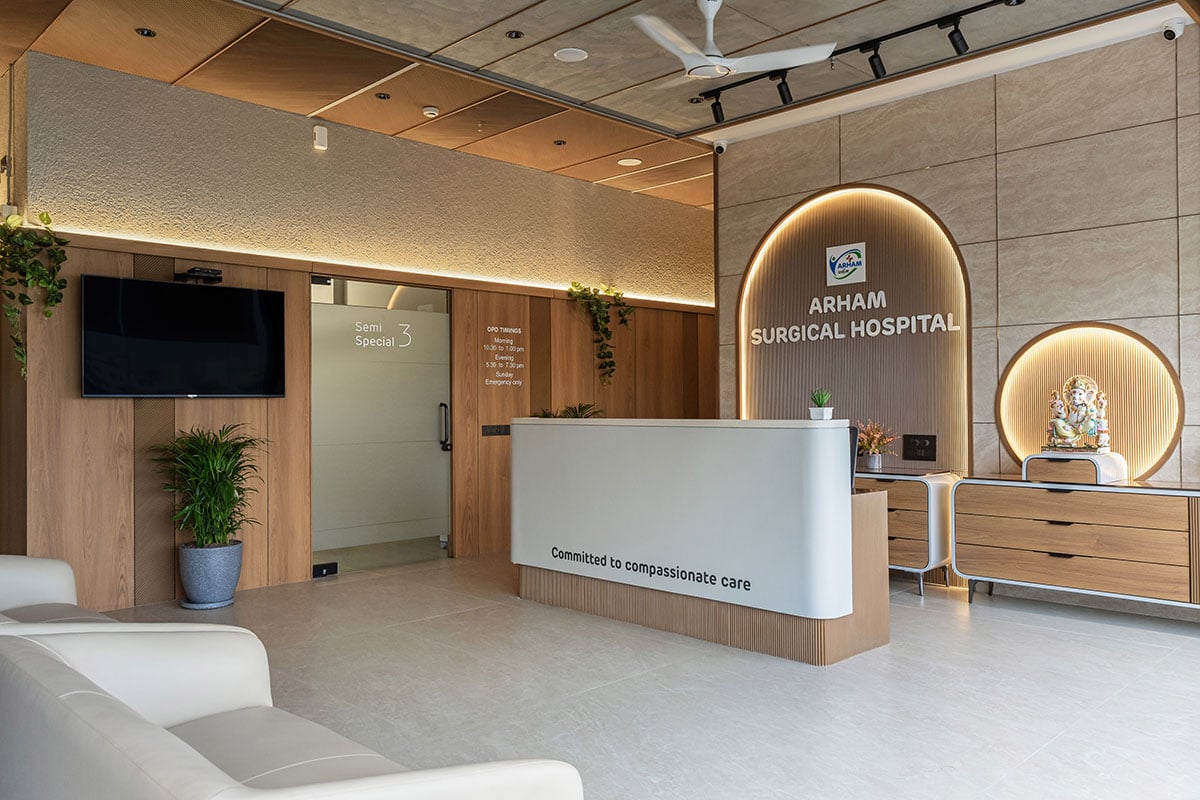
Modern healthcare clinic reception

Clinics & practices

Services, accessibility, trust and contact pathways.

Education and coaching delivered online

Education & coaching

Program details, expectations and applications.

Real estate agent handing over house keys

Property businesses

Listings, local areas and lead capture.

GOOD QUESTIONS, CLEAR ANSWERS

Questions worth asking first.

A good website begins with a realistic scope and an open conversation. Here are common questions before design and development work begins.

Climbing to the summit represents steady business growth

The page count depends on your offer and what visitors need to understand. We can plan a focused small-business website or a larger information architecture. The exact pages and revisions will be stated in your proposal.

Yes, subject to an initial review of its platform, content, design, performance, and access. We can decide whether to improve what already exists or rebuild parts of the experience.

Responsive design is part of our approach. We review important layouts and actions at desktop, tablet, and mobile sizes, while accounting for the constraints of the chosen platform and content.

Both can be suitable depending on the job. WordPress often works well for service and publishing websites; Shopify is frequently suitable for product-focused online stores. We recommend a platform after discussing your requirements.

That can be discussed as part of scope. We need accurate business information from you, and will distinguish supplied materials, custom copywriting, illustration, photography, and licensing in the agreed deliverables.

We can establish solid on-page and technical foundations, such as sensible headings, URLs, metadata, internal links, image descriptions, and crawlability. Ongoing SEO campaigns, content creation, and backlinks are separate services unless explicitly included.

Potentially, yes. We will confirm compatibility, third-party subscriptions, privacy requirements, integration scope, and testing before committing to functionality.

The timeline depends on the number of pages, design complexity, functionality, feedback rounds, content readiness, and integrations. We will provide a realistic schedule after discovery instead of promising a universal completion date.

Ownership, hosting, domain access, content licensing and account administration should be explicitly documented in the project agreement. We favor transparency and a clear handover.

On a suitable content-management platform, many text, image, and article updates can be handled through an editor. We will explain what you can safely edit and which changes may need technical support.

Launch can include a defined stabilization period or an optional care plan. Continued updates, hosting, backups, security maintenance, content additions and optimization should be covered by an agreed support scope.

No responsible agency can guarantee a particular number of customers solely from launching a website. We build for clarity, usability, and measurable next steps, then use real data to guide improvements.

LET’S BUILD A CLEARER DIGITAL HOME

Your next customer deserves a better first impression.

Whether you need a new website, a thoughtful redesign, or help making your current site easier to use, tell us what you want people to understand and do. We’ll help identify a sensible starting point.

Or write to info@webskout.com

Climbing to the summit represents steady business growth
Scroll to Top